Page 1 of 1
logo discussion
Posted: Sat Feb 06, 2010 10:56 am
by goon attack
can you imagine how much better it would be if these moron teams had better logos?
The sharks should do something like this instead of that monstrosity they use now:

and the lightning? WTMF? GET rid of the wording and go simple:

The canucks should just give up and use this:

Re: logo discussion
Posted: Sat Feb 06, 2010 12:37 pm
by gaijin
goon attack wrote:
and the lightning? WTMF? GET rid of the wording and go simple:
Regarding the lightning, that's almost exactly what I've thought they should do for a while. Instead of red and yellow, have a solid blue jersey with a gray bolt (exactly like the Shazam bolt in that T-shirt), and a horizontal gray stripe (or stripes) on the sleeve. Simple. Effective.
Re: logo discussion
Posted: Sat Feb 06, 2010 2:09 pm
by ViPeRx007
Dallas:

Re: logo discussion
Posted: Sat Feb 06, 2010 2:28 pm
by fargoblues
Columbus Blue Jackets?

Re: logo discussion
Posted: Sat Feb 06, 2010 3:20 pm
by goon attack
gajin, I'm with you. it would be an instant retro looking classic. I already like Tampa Bay's unis, a lot. I think they're my favorites in the whole league. If they came out with a really simple thing like that, and the trim was done well, I'd actually buy something from them.
Re: logo discussion
Posted: Sat Feb 06, 2010 6:37 pm
by F Keenan
Re: logo discussion
Posted: Sat Feb 06, 2010 8:08 pm
by gaijin
The Dallas phallus?
Re: logo discussion
Posted: Sun Feb 07, 2010 1:48 am
by ohio BLUES
ViPeRx007 wrote:Dallas:
I'd have a new favorite team!

Re: logo discussion
Posted: Sun Feb 07, 2010 10:20 am
by philco_3
F Keenan wrote: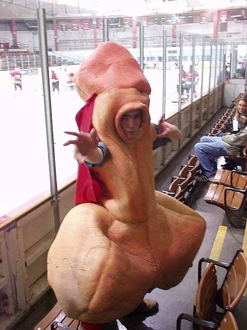
Ah Captain Penis from the San Fransisco minor league team.
Re: logo discussion
Posted: Sun Feb 07, 2010 9:36 pm
by keithp40
F Keenan wrote:
i heard about that guy, that is actually in Detroit.
Re: logo discussion
Posted: Sun Feb 07, 2010 10:19 pm
by fargoblues
You're both wrong.
It's Scrotie, the mascot of the hockey team (the Nads) at the Rhode Island School of Design.
While serious athletics are pretty much out of the question at RISD, students definitely have fun with what they’ve got. Imagine parents’ weekend, where half the campus is drunk and yelling obscenities at a team of completely bewildered ice-hockey players while a giant penis in a cape (Scrotie, the mascot) leads cheers from the sidelines. Often, the Jockstraps (cheerleading team) will rouse the RISD crowd into heckling some players so badly that fights ensue. Another rallying move is when Scrotie tries to ram the goalposts tip-first—some images really are worth 1,000 words. Once in a while, there will be a scandal during which Scrotie is kidnapped by an unnamed group. The ransom demands that all ice hockey players (the Nads) skate around the rink after the game in their underwear in order to retrieve their precious mascot. The following drawn-out drama will be involved and scandalous in order to fill the stands. The Nads sometimes score on themselves, but on the off chance that you do see them win, it’s not only a blast, but it’s totally priceless to see the look on the other teams’ faces. Nobody wants to get beaten by the Nads.
The Balls—the basketball team—is a slightly different experience. There is no obscene mascot or profane cheerleading team, and most games appear to be fairly average, but the advertising is uniquely RISD. While walking across campus, you may encounter several posters of RISD's beloved president nonchalantly cradling two basketballs to his chest and solemnly urging the RISD community to “Support Your Balls.” RISD sports gets an A for amusement.
http://sportsclimax.com/bizarre-moments ... e-mascots/
Re: logo discussion
Posted: Thu Feb 11, 2010 8:55 pm
by keithp40
[quote="fargoblues"]You're both wrong.
huh....you're right, no on in detroit would have one that big
Re: logo discussion
Posted: Thu Feb 11, 2010 9:12 pm
by fargoblues
keithp40 wrote:fargoblues wrote:You're both wrong.
huh....you're right, if it was from Detroit it would be permanently jammed up a giant anus, likely wearing a wings jersey.
FTFY