

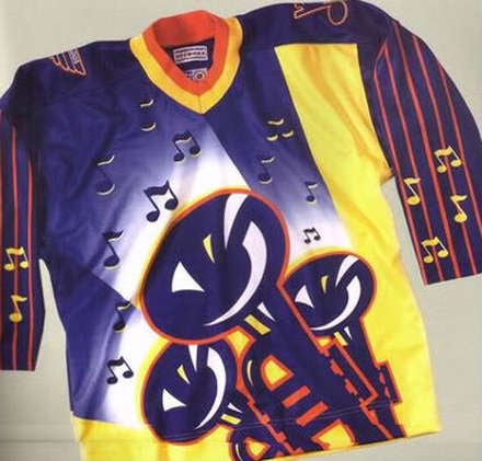
Ewwwwwwwwwwwwwwwwdmiles2186 wrote:I was looking for a picture of the trumpet shoulder patches we wore on the clown jerseys. I always liked those. Instead I found this abomination...
(Image was too big to be posted on forum.)
http://4.bp.blogspot.com/-DF77ugKzTSY/U ... STL3rd.png
Now I can think of nothing else.
"New" uniforms and logo for 2014-2015?
Moderator: LGB Mods
Re: "New" uniforms and logo for 2014-2015?
Official Chatzy Sponsor Extraordinaire - Just wait till we score four...
Official Sponsor of FlashChat.. why am I alone still?

Official Sponsor of FlashChat.. why am I alone still?
-
WaukeeBlues

- Hockey God

- Posts: 6163
- Joined: Sun Apr 08, 2007 3:00 pm
- Location: Phi Alpha
Re: "New" uniforms and logo for 2014-2015?
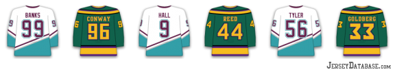
They're going to go retro. I'm calling it right now. Personally I hate the trend. NBA started it then NFL now NHL... it's dumb. Leave the damn 1980's color schemes in the 1980's. Current Oilers jerseys are case in point. I just don't like them. Looks like the Blues are going to follow suit by dropping the darker blue and yellow in favor of the lighter. At least we're not re-adopting the old bluenote with the rounded edges? Thank God.
Official 2021-2022 LGB Sponsor of Torey Krug
Official 2021 LGB Sponsor of Brayden Schenn
Official 2018-2019 LGB Sponsor of Jaden Schwartz
2018 LGB Playoff Challenge Champ
Official 2017-2018 LGB Sponsor of Vladimir Tarasenko
Official 2016-2017 LGB Sponsor of Scottie Upshall
Official 2015-2016 LGB Sponsor of Kevin Shattenkirk
Official 2021 LGB Sponsor of Brayden Schenn
Official 2018-2019 LGB Sponsor of Jaden Schwartz
2018 LGB Playoff Challenge Champ
Official 2017-2018 LGB Sponsor of Vladimir Tarasenko
Official 2016-2017 LGB Sponsor of Scottie Upshall
Official 2015-2016 LGB Sponsor of Kevin Shattenkirk
-
dmiles2186

- Hockey God
- Posts: 7288
- Joined: Mon Nov 20, 2006 12:29 am
- Location: Selling Air Bombays--for kids who want to coach
Re: "New" uniforms and logo for 2014-2015?
You like this...WaukeeBlues wrote:They're going to go retro. I'm calling it right now. Personally I hate the trend. NBA started it then NFL now NHL... it's dumb. Leave the damn 1980's color schemes in the 1980's. Current Oilers jerseys are case in point. I just don't like them. Looks like the Blues are going to follow suit by dropping the darker blue and yellow in favor of the lighter. At least we're not re-adopting the old bluenote with the rounded edges? Thank God.

better than this...?

I've gotta disagree with you there. Personally, I think lighter colors are better. The lighter colors pop, the darker colors don't. To each his own, if you prefer that style, more power to you. I do like to see the variety of colors out there as opposed to everyone wearing dark blue.
2015-2016 LGB Sponsor of Not Ott, because he is a booger-eating dumb dumb
Re: "New" uniforms and logo for 2014-2015?
The real question is if Mitchell and Ness made these and sold them, would ya?gaijin wrote:Maybe we could start a petition for the Blues to wear these for the final home game of the regular season? Once and once ONLY. Or maybe next Christmas as our very own "ugly sweater" competition. Then they can auction them off as a charity fundraiser.ViPeRx007 wrote:gaijin wrote:No logo/jersey thread is complete without this abomination showing up.glen a richter wrote:Disagree with them all, I vote for this one.

In a weird way I like this jersey just because of this.
*I tend to only post on this site when I'm intoxicated.
-
WaukeeBlues
- Hockey God
- Posts: 6163
- Joined: Sun Apr 08, 2007 3:00 pm
- Location: Phi Alpha
Re: "New" uniforms and logo for 2014-2015?
No I liked these ones...dmiles2186 wrote:You like this...WaukeeBlues wrote:They're going to go retro. I'm calling it right now. Personally I hate the trend. NBA started it then NFL now NHL... it's dumb. Leave the damn 1980's color schemes in the 1980's. Current Oilers jerseys are case in point. I just don't like them. Looks like the Blues are going to follow suit by dropping the darker blue and yellow in favor of the lighter. At least we're not re-adopting the old bluenote with the rounded edges? Thank God.
better than this...?
I've gotta disagree with you there. Personally, I think lighter colors are better. The lighter colors pop, the darker colors don't. To each his own, if you prefer that style, more power to you. I do like to see the variety of colors out there as opposed to everyone wearing dark blue.

The RBK edge Oilers jerseys were awful. They look like practice jerseys.
Official 2021-2022 LGB Sponsor of Torey Krug
Official 2021 LGB Sponsor of Brayden Schenn
Official 2018-2019 LGB Sponsor of Jaden Schwartz
2018 LGB Playoff Challenge Champ
Official 2017-2018 LGB Sponsor of Vladimir Tarasenko
Official 2016-2017 LGB Sponsor of Scottie Upshall
Official 2015-2016 LGB Sponsor of Kevin Shattenkirk
Official 2021 LGB Sponsor of Brayden Schenn
Official 2018-2019 LGB Sponsor of Jaden Schwartz
2018 LGB Playoff Challenge Champ
Official 2017-2018 LGB Sponsor of Vladimir Tarasenko
Official 2016-2017 LGB Sponsor of Scottie Upshall
Official 2015-2016 LGB Sponsor of Kevin Shattenkirk