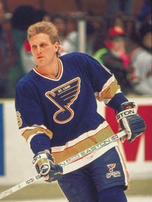
Ding. Pretty much what dmiles said.dmiles2186 wrote:I'm not speaking for Curt, but the fact that the clown jerseys contain red is a crime unto itself. Those jerseys were the first ones I remember from growing up. It was the first jersey I ever owned (I was 9 when they implemented the look). I actually really liked them.Oaklandblue wrote:Out of curiosity, what didn't you like about the Clown Jersey? I thought they were one of the more unique sweaters out there that didn't look horrible (See the V Canucks jersey, for instance). I have to say the one thing I never liked about it, and it's my favorite sweater, is the bluenote itself. I like the sharper logo without St. Louis written into it. Someone out there has a variant of the clown jersey with that logo and I've come > < close to just buying a blank and putting one on there.
But seriously, what don't you like about it?
But from the crooked/slanted jersey numbers, to the diagonal stripes, to the (ugh) red, it's just sort of a mess.
The stupid slanted numbers, a sea of red at the bottom on away jersey (why?), and the gaudy "guitar strings". I didn't mind the thin red outlines in the late 80's & early 90's classic looking jerseys (even though zero red is ideal)...but the sea of red was stupid.
The home jerseys weren't as bad because it had far less red...but the diagonal guitar string stripes and the slanted numbers were horrible.
I didn't mind the bluenote on the clown jersey, but the version we have now, which came on with the new jerseys in '98...flat out rocks and is one of the best logos in the NHL.
Now, with that said, the clown jerseys weren't considered to be awful at the time because a number of teams had slanted stripes/numbers and goofy things going on with the jerseys that were considered more modern and "cool". But looking back on it, that was just a very bad era in jersey design in the NHL (and to be honest, the tacky/gaudy design tactics were a nationwide thing in all media & advertising at the time). The classic look works for a reason...it's simple, it's classy, and it works. Don't F with it. That is
Less is always more with hockey jerseys. Too many team marketing departments in the late 90's didn't understand that at all and decided to get too busy with the designs and implement new printing processes and outside of the box design ideas.