Ah, I asked because Cardiff's owner did something like you mentioned. A Malaysian billionaire, Vincent Tan, bought CCFC who are traditionally known as the Bluebirds and play in blue uniforms. He decided to change their uniforms to red because that color was more popular in Asia where it's associated with good luck. Needless to say, it wasn't a popular move and the new jerseys haven't sold well in Britain...not sure about sales in Malaysia.cardsfan04 wrote:Nah. I like soccer, but don't really have a team. If that question is in reference to my username, it's St. Louis Cardinals.ecbm wrote:You a fan of Cardiff City FC?cardsfan04 wrote: Personally, I'm a little disappointing in Stillman for not conducting a focus group in Bangkok over our new sweaters.
Blues New Sweater Thread (concepts, wish list, etc)
Moderator: LGB Mods
Re: Blues New Sweater Thread (concepts, wish list, etc)

Re: Blues New Sweater Thread (concepts, wish list, etc)
I agree, the cardinals should wear blue and gold, the other kids are doing it, so why shouldn't stickball?ecbm wrote:Ah, I asked because Cardiff's owner did something like you mentioned. A Malaysian billionaire, Vincent Tan, bought CCFC who are traditionally known as the Bluebirds and play in blue uniforms. He decided to change their uniforms to red because that color was more popular in Asia where it's associated with good luck. Needless to say, it wasn't a popular move and the new jerseys haven't sold well in Britain...not sure about sales in Malaysia.cardsfan04 wrote:Nah. I like soccer, but don't really have a team. If that question is in reference to my username, it's St. Louis Cardinals.ecbm wrote:You a fan of Cardiff City FC?cardsfan04 wrote: Personally, I'm a little disappointing in Stillman for not conducting a focus group in Bangkok over our new sweaters.
Luton Town stays Orange, and Orange they shall stay!
Official Chatzy Sponsor Extraordinaire - Just wait till we score four...
Official Sponsor of FlashChat.. why am I alone still?

Official Sponsor of FlashChat.. why am I alone still?
-
cardsfan04
- Hall Of Fame

- Posts: 4027
- Joined: Sat Nov 13, 2010 12:43 am
Re: Blues New Sweater Thread (concepts, wish list, etc)
Oh, lol. I saw the Card in Cardiff and thought that's where you were going with it. I was being facetious about the focus group. It's kinda funny that that actually kinda happened lol.ecbm wrote:Ah, I asked because Cardiff's owner did something like you mentioned. A Malaysian billionaire, Vincent Tan, bought CCFC who are traditionally known as the Bluebirds and play in blue uniforms. He decided to change their uniforms to red because that color was more popular in Asia where it's associated with good luck. Needless to say, it wasn't a popular move and the new jerseys haven't sold well in Britain...not sure about sales in Malaysia.cardsfan04 wrote:Nah. I like soccer, but don't really have a team. If that question is in reference to my username, it's St. Louis Cardinals.ecbm wrote:You a fan of Cardiff City FC?cardsfan04 wrote: Personally, I'm a little disappointing in Stillman for not conducting a focus group in Bangkok over our new sweaters.
2010-2011 Official LGB Sponsor of Kevin Shattenkirk
2016-2017 Official LGB Sponsor of Dmitri Jaskin
2017-2018 Official LGB Sponsor of Jake Allen
2016-2017 Official LGB Sponsor of Dmitri Jaskin
2017-2018 Official LGB Sponsor of Jake Allen
-
Portland Blues

- Hockey God

- Posts: 5099
- Joined: Fri Apr 18, 2003 12:38 pm
- Location: Portland Orygun
Re: Blues New Sweater Thread (concepts, wish list, etc)
They should make a new jersey with Nelly on it. Even Viper says more people recognize Nelly than Oshie!!!
-
Oaklandblue

- All-Star

- Posts: 1423
- Joined: Sun Nov 06, 2011 11:20 pm
Re: Blues New Sweater Thread (concepts, wish list, etc)
Ok!Portland Blues wrote:They should make a new jersey with Nelly on it. Even Viper says more people recognize Nelly than Oshie!!!

And for those who MUST have the Arch on their sweaters:

2017-2018 LGB Sponsor of Alexander Steen
2017-2018 LGB Sponsor of Jaromir Jagr, Calgary Flames
2016-2017 LGB Sponsor of Brian Elliott, Calgary Flames
2015-2016 LGB Sponsor of Ryan "Turn that leaf on the wind into a shrimp on the bar-bee" Reaves
2015-2016 LGB Sponsor of Obviously Not Steve Ott
2015-2016 LGB Sponsor of Steve "Chirps-A-Lot" Ott
2015 LGB Supporter of the New York Rangers
2014-2015 LGB Sponsor of Patrik "No-Timer" Berglund
2013-2014 LGB Sponsor of Derek "In The Middle" Roy
2012-2013 LGB Sponsor of Chris "NO SLEEP TIL THE CUP!" Stewart - Shhhhh!!!
-
dmiles2186

- Hockey God
- Posts: 7288
- Joined: Mon Nov 20, 2006 12:29 am
- Location: Selling Air Bombays--for kids who want to coach
Re: Blues New Sweater Thread (concepts, wish list, etc)
No Nelly jersey is complete without fendi capri pants and manicured toes.Oaklandblue wrote:Ok!Portland Blues wrote:They should make a new jersey with Nelly on it. Even Viper says more people recognize Nelly than Oshie!!!
And for those who MUST have the Arch on their sweaters:
2015-2016 LGB Sponsor of Not Ott, because he is a booger-eating dumb dumb

Re: Blues New Sweater Thread (concepts, wish list, etc)
New Playoff tee for STL? lol

2015-2016 LGB Sponsor or Brian Elliott
2014-2015 LGB Sponsor of Jori Lehtera
2013-2014 LGB Sponsor of Chris Stewart / Steve Ott and the trade that made it happen!
2012-errr.......Just 2013 LGB Sponsor of Andy McDonald
2014-2015 LGB Sponsor of Jori Lehtera
2013-2014 LGB Sponsor of Chris Stewart / Steve Ott and the trade that made it happen!
2012-errr.......Just 2013 LGB Sponsor of Andy McDonald
-
dmiles2186
- Hockey God
- Posts: 7288
- Joined: Mon Nov 20, 2006 12:29 am
- Location: Selling Air Bombays--for kids who want to coach
Re: Blues New Sweater Thread (concepts, wish list, etc)
Uni Watch write up:
http://espn.go.com/nhl/story/_/id/11421 ... new-jersey
http://espn.go.com/nhl/story/_/id/11421 ... new-jersey
The classics are classic for a reason.
The uni-verse has taught us that lesson countless times, and it did so again this week when the St. Louis Blues finally dispensed of all the nonsense and got back to basics with their new uniform design.
How superior is this new design to the one it's replacing? Let us count the ways:
1. No more apron strings.
Those annoying gold stripes that ran down the torso and continued onto the pants, which were added to the Blues' uniform in 2007, were a disaster from the get-go. They made the chest logo feel too boxed in and confined, they looked like dangling apron strings, and they almost never lined up from jersey to pant leg. They reeked of gimmickry and templating -- two surefire ways to ruin a uniform -- and getting rid of them is a textbook case of addition by subtraction.
2. No more Ree-box.
Uni Watch
The Blues are one of several teams that have employed the so-called Ree-box -- a contrast-colored notch on the back of the jersey whose only apparent function is to showcase the Reebok logo. The Reebok mark still appears on the new jerseys, of course, but it's much less prominent, which is a serious improvement.
3. The return of the belly stripes.
Hockey is the only major sport whose jerseys are designed to be worn untucked, which is why so many teams throughout the decades have made use of that lower-abdomen real estate by putting stripes there. The Blues' outgoing jerseys were blank in that area, which looked too plain, but the new ones have restored the stripes. Much better.
In short, it's a win-win-win. And if these new uniforms look familiar, they should, because they're extremely similar to what the Blues wore from 1998 through 2007, right down to the lettering and numbering on the back. It's almost as if the Blues said, "OK, these past seven years have been a failed experiment. Let's go back to what works."
Interestingly, this isn't the first time the Blues have deviated from their classic look and then come down with a case of buyer's remorse. In 1984 they plastered big, ugly letters across their chest, but after three seasons they thought better of it. Then in 1995 they added diagonal striping and lots of red, but three seasons later they basically said, "Never mind." This is a team whose design pendulum keeps swinging one way and then back the other.
And it could have swung ever further. In 1996 the Blues were planning to introduce a Louis Armstrong-themed alternate design that would likely have gone down as the worst jersey in NHL history. Unfortunately, then-coach Mike Keenan put the kibosh on that one, thereby denying the rest of us the chance to have a good laugh at his team's expense.
So while the Blues' new uniforms are superb, it's worth asking how long the team will stick with this latest design before scrapping it for a "creative" replacement, how miserable that replacement will be, and how long it will then take for the team to go back to another traditional design. For now, though, enjoy this latest swing of the pendulum before it heads back the other way.
Paul Lukas will never forgive Mike Keenan for scuttling that alternate jersey. If you liked this column, you'll probably like his Uni Watch Blog, plus you can follow him on Twitter and Facebook. Want to learn about his Uni Watch Membership Program, be added to his mailing list so you'll always know when a new column has been posted, or just ask him a question? Contact him here.
2015-2016 LGB Sponsor of Not Ott, because he is a booger-eating dumb dumb
Re: Blues New Sweater Thread (concepts, wish list, etc)
The best thing Keenan did in St. Louis...maybe the only good thing.In 1996 the Blues were planning to introduce a Louis Armstrong-themed alternate design that would likely have gone down as the worst jersey in NHL history. Unfortunately, then-coach Mike Keenan put the kibosh on that one, thereby denying the rest of us the chance to have a good laugh at his team's expense.


Re: Blues New Sweater Thread (concepts, wish list, etc)
The Ducks and the Kings wore equally bad third jerseys in that era...the Blues would not have been alone.ecbm wrote:The best thing Keenan did in St. Louis...maybe the only good thing.In 1996 the Blues were planning to introduce a Louis Armstrong-themed alternate design that would likely have gone down as the worst jersey in NHL history. Unfortunately, then-coach Mike Keenan put the kibosh on that one, thereby denying the rest of us the chance to have a good laugh at his team's expense.

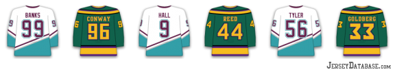
That was a goofy, stupid era of gaudy third jerseys. I don't know what teams were thinking.
But the Kings have to be the team that overall throughout their history of numerous jersey changes, have had the most bad jerseys. They can't ever seem to do anything right...except for their black jerseys in the early 90's. Those were cool.
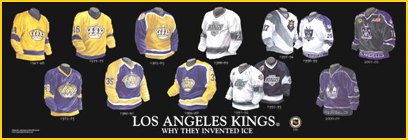
Why they think "LOS ANGELES" written inside the bottom stripe is a good look, is beyond me. It's horrible. And their logo is ugly too.
They need to go back to their early 90's black & white...everything else is awful.
LETS GO BLUES RADIO
LIVE weekly broadcasts on YouTube & http://www.LetsGoBlues.com/radio!
Twitter: https://twitter.com/curtprice
Lets Go Blues Radio Twitter: https://twitter.com/lgbradio
Instagram: https://www.instagram.com/cprice12/
Lets Go Blues Radio Instagram: https://www.instagram.com/lgbradio/
LIVE weekly broadcasts on YouTube & http://www.LetsGoBlues.com/radio!
Twitter: https://twitter.com/curtprice
Lets Go Blues Radio Twitter: https://twitter.com/lgbradio
Instagram: https://www.instagram.com/cprice12/
Lets Go Blues Radio Instagram: https://www.instagram.com/lgbradio/
Re: Blues New Sweater Thread (concepts, wish list, etc)
I don't mind the old purple & yellow Kings jerseys with the crown. It's got a kind of campy feel at this point too which seems about right for a team in LA.
Now the Mighty Ducks of Anaheim jerseys-perfect example of too much focus-grouping and concentration on marketability ruining a product. Those jerseys were monstrosities-nothing redeeming at all. Then again almost everything about that franchise to start with was ill-conceived.
Now the Mighty Ducks of Anaheim jerseys-perfect example of too much focus-grouping and concentration on marketability ruining a product. Those jerseys were monstrosities-nothing redeeming at all. Then again almost everything about that franchise to start with was ill-conceived.
Re: Blues New Sweater Thread (concepts, wish list, etc)
I'm sure even dmiles would say that!ecbm wrote:I don't mind the old purple & yellow Kings jerseys with the crown. It's got a kind of campy feel at this point too which seems about right for a team in LA.
Now the Mighty Ducks of Anaheim jerseys-perfect example of too much focus-grouping and concentration on marketability ruining a product. Those jerseys were monstrosities-nothing redeeming at all. Then again almost everything about that franchise to start with was ill-conceived.

Official Stalker of Paul "Speedy Gonzalez" Kariya
2014-2015 Official LGB Sponsor of Vladimir Tarasenko
TW Tiger Woods TW
Re: Blues New Sweater Thread (concepts, wish list, etc)
I never liked the purple and yellow. Now they have purple and black. It's just ugly. I get that those are "royal colors" but whatever...they are an eyesore. Purple and black belongs on an NBA jersey...not an NHL sweater.ecbm wrote:I don't mind the old purple & yellow Kings jerseys with the crown. It's got a kind of campy feel at this point too which seems about right for a team in LA.
Now the Mighty Ducks of Anaheim jerseys-perfect example of too much focus-grouping and concentration on marketability ruining a product. Those jerseys were monstrosities-nothing redeeming at all. Then again almost everything about that franchise to start with was ill-conceived.
LETS GO BLUES RADIO
LIVE weekly broadcasts on YouTube & http://www.LetsGoBlues.com/radio!
Twitter: https://twitter.com/curtprice
Lets Go Blues Radio Twitter: https://twitter.com/lgbradio
Instagram: https://www.instagram.com/cprice12/
Lets Go Blues Radio Instagram: https://www.instagram.com/lgbradio/
LIVE weekly broadcasts on YouTube & http://www.LetsGoBlues.com/radio!
Twitter: https://twitter.com/curtprice
Lets Go Blues Radio Twitter: https://twitter.com/lgbradio
Instagram: https://www.instagram.com/cprice12/
Lets Go Blues Radio Instagram: https://www.instagram.com/lgbradio/
-
dmiles2186
- Hockey God
- Posts: 7288
- Joined: Mon Nov 20, 2006 12:29 am
- Location: Selling Air Bombays--for kids who want to coach
Re: Blues New Sweater Thread (concepts, wish list, etc)
The Ducks won the 1994 Junior Goodwill Games, you monsters!STLADOGG wrote:I'm sure even dmiles would say that!ecbm wrote:I don't mind the old purple & yellow Kings jerseys with the crown. It's got a kind of campy feel at this point too which seems about right for a team in LA.
Now the Mighty Ducks of Anaheim jerseys-perfect example of too much focus-grouping and concentration on marketability ruining a product. Those jerseys were monstrosities-nothing redeeming at all. Then again almost everything about that franchise to start with was ill-conceived.
2015-2016 LGB Sponsor of Not Ott, because he is a booger-eating dumb dumb


Re: Blues New Sweater Thread (concepts, wish list, etc)
If the home uniform had a white or yellow collar it would look better. It should be different from the shoulder color. Even Jesus said that.
2015-2016 Official LGB Sponsor of Jaden Schwartz (IR) & The Hockey Gods
2014-2015 Official LGB Sponsor of T.J. Oshie
2013-2014 Official LGB Sponsor of Kevin Shattenkirk
2012-2013 Official LGB Sponsor of Ryan Reaves
2011-2012 Official LGB Sponsor of Vladimir Tarasenko
2010-2011 Official LGB Sponsor of Vladimir Tarasenko
2014-2015 Official LGB Sponsor of T.J. Oshie
2013-2014 Official LGB Sponsor of Kevin Shattenkirk
2012-2013 Official LGB Sponsor of Ryan Reaves
2011-2012 Official LGB Sponsor of Vladimir Tarasenko
2010-2011 Official LGB Sponsor of Vladimir Tarasenko
Re: Blues New Sweater Thread (concepts, wish list, etc)
dmiles2186 wrote:Uni Watch write up:
http://espn.go.com/nhl/story/_/id/11421 ... new-jersey
The classics are classic for a reason.
The uni-verse has taught us that lesson countless times, and it did so again this week when the St. Louis Blues finally dispensed of all the nonsense and got back to basics with their new uniform design.
How superior is this new design to the one it's replacing? Let us count the ways:
1. No more apron strings.
Those annoying gold stripes that ran down the torso and continued onto the pants, which were added to the Blues' uniform in 2007, were a disaster from the get-go. They made the chest logo feel too boxed in and confined, they looked like dangling apron strings, and they almost never lined up from jersey to pant leg. They reeked of gimmickry and templating -- two surefire ways to ruin a uniform -- and getting rid of them is a textbook case of addition by subtraction.
2. No more Ree-box.
Uni Watch
The Blues are one of several teams that have employed the so-called Ree-box -- a contrast-colored notch on the back of the jersey whose only apparent function is to showcase the Reebok logo. The Reebok mark still appears on the new jerseys, of course, but it's much less prominent, which is a serious improvement.
3. The return of the belly stripes.
Hockey is the only major sport whose jerseys are designed to be worn untucked, which is why so many teams throughout the decades have made use of that lower-abdomen real estate by putting stripes there. The Blues' outgoing jerseys were blank in that area, which looked too plain, but the new ones have restored the stripes. Much better.
In short, it's a win-win-win. And if these new uniforms look familiar, they should, because they're extremely similar to what the Blues wore from 1998 through 2007, right down to the lettering and numbering on the back. It's almost as if the Blues said, "OK, these past seven years have been a failed experiment. Let's go back to what works."
Interestingly, this isn't the first time the Blues have deviated from their classic look and then come down with a case of buyer's remorse. In 1984 they plastered big, ugly letters across their chest, but after three seasons they thought better of it. Then in 1995 they added diagonal striping and lots of red, but three seasons later they basically said, "Never mind." This is a team whose design pendulum keeps swinging one way and then back the other.
And it could have swung ever further. In 1996 the Blues were planning to introduce a Louis Armstrong-themed alternate design that would likely have gone down as the worst jersey in NHL history. Unfortunately, then-coach Mike Keenan put the kibosh on that one, thereby denying the rest of us the chance to have a good laugh at his team's expense.
So while the Blues' new uniforms are superb, it's worth asking how long the team will stick with this latest design before scrapping it for a "creative" replacement, how miserable that replacement will be, and how long it will then take for the team to go back to another traditional design. For now, though, enjoy this latest swing of the pendulum before it heads back the other way.
Paul Lukas will never forgive Mike Keenan for scuttling that alternate jersey. If you liked this column, you'll probably like his Uni Watch Blog, plus you can follow him on Twitter and Facebook. Want to learn about his Uni Watch Membership Program, be added to his mailing list so you'll always know when a new column has been posted, or just ask him a question? Contact him here.
Eh? I have NEVER thought the yellow piping looked like dangling apron strings. I thought he was referring to the draw strings at the neck line on the third jerseys...and was like, "we don't have those on our regular jerseys".Apron strings
That is the first time I have ever heard them referred to as that.
What? Who calls them that?Belly stripes
If you do a Google search for "NHL belly stripes"...the first link is HIS article...and nothing else about "belly stripes" on a hockey jersey.
Does this guy just make up words?
It's worth asking? Really? Why?So while the Blues' new uniforms are superb, it's worth asking how long the team will stick with this latest design before scrapping it for a "creative" replacement, how miserable that replacement will be, and how long it will then take for the team to go back to another traditional design. For now, though, enjoy this latest swing of the pendulum before it heads back the other way.
Considering that the Blues jerseys have been overall quite good in their history...aside from the clown jersey era... I'm not sure why this guy feels they'll all of a sudden move to something that sucks after having these for a while.
We don't have the LA Kings marketing dept. running things here.
Meh...maybe I'm being picky. But this article just rubbed me the wrong way.
LETS GO BLUES RADIO
LIVE weekly broadcasts on YouTube & http://www.LetsGoBlues.com/radio!
Twitter: https://twitter.com/curtprice
Lets Go Blues Radio Twitter: https://twitter.com/lgbradio
Instagram: https://www.instagram.com/cprice12/
Lets Go Blues Radio Instagram: https://www.instagram.com/lgbradio/
LIVE weekly broadcasts on YouTube & http://www.LetsGoBlues.com/radio!
Twitter: https://twitter.com/curtprice
Lets Go Blues Radio Twitter: https://twitter.com/lgbradio
Instagram: https://www.instagram.com/cprice12/
Lets Go Blues Radio Instagram: https://www.instagram.com/lgbradio/
Re: Blues New Sweater Thread (concepts, wish list, etc)
Can't disagree with most of your annoyance Curt but what first grabbed me about that article was a nice warm feeling-the Blues are relevant enough to merit a puff piece about their unis on ESPN. For the record, I've heard that stupid piping called apron strings several times.
-
Oaklandblue
- All-Star
- Posts: 1423
- Joined: Sun Nov 06, 2011 11:20 pm
Re: Blues New Sweater Thread (concepts, wish list, etc)
Out of curiosity, what didn't you like about the Clown Jersey? I thought they were one of the more unique sweaters out there that didn't look horrible (See the V Canucks jersey, for instance). I have to say the one thing I never liked about it, and it's my favorite sweater, is the bluenote itself. I like the sharper logo without St. Louis written into it. Someone out there has a variant of the clown jersey with that logo and I've come > < close to just buying a blank and putting one on there.cprice12 wrote:dmiles2186 wrote:Uni Watch write up:
http://espn.go.com/nhl/story/_/id/11421 ... new-jersey
The classics are classic for a reason.
The uni-verse has taught us that lesson countless times, and it did so again this week when the St. Louis Blues finally dispensed of all the nonsense and got back to basics with their new uniform design.
How superior is this new design to the one it's replacing? Let us count the ways:
1. No more apron strings.
Those annoying gold stripes that ran down the torso and continued onto the pants, which were added to the Blues' uniform in 2007, were a disaster from the get-go. They made the chest logo feel too boxed in and confined, they looked like dangling apron strings, and they almost never lined up from jersey to pant leg. They reeked of gimmickry and templating -- two surefire ways to ruin a uniform -- and getting rid of them is a textbook case of addition by subtraction.
2. No more Ree-box.
Uni Watch
The Blues are one of several teams that have employed the so-called Ree-box -- a contrast-colored notch on the back of the jersey whose only apparent function is to showcase the Reebok logo. The Reebok mark still appears on the new jerseys, of course, but it's much less prominent, which is a serious improvement.
3. The return of the belly stripes.
Hockey is the only major sport whose jerseys are designed to be worn untucked, which is why so many teams throughout the decades have made use of that lower-abdomen real estate by putting stripes there. The Blues' outgoing jerseys were blank in that area, which looked too plain, but the new ones have restored the stripes. Much better.
In short, it's a win-win-win. And if these new uniforms look familiar, they should, because they're extremely similar to what the Blues wore from 1998 through 2007, right down to the lettering and numbering on the back. It's almost as if the Blues said, "OK, these past seven years have been a failed experiment. Let's go back to what works."
Interestingly, this isn't the first time the Blues have deviated from their classic look and then come down with a case of buyer's remorse. In 1984 they plastered big, ugly letters across their chest, but after three seasons they thought better of it. Then in 1995 they added diagonal striping and lots of red, but three seasons later they basically said, "Never mind." This is a team whose design pendulum keeps swinging one way and then back the other.
And it could have swung ever further. In 1996 the Blues were planning to introduce a Louis Armstrong-themed alternate design that would likely have gone down as the worst jersey in NHL history. Unfortunately, then-coach Mike Keenan put the kibosh on that one, thereby denying the rest of us the chance to have a good laugh at his team's expense.
So while the Blues' new uniforms are superb, it's worth asking how long the team will stick with this latest design before scrapping it for a "creative" replacement, how miserable that replacement will be, and how long it will then take for the team to go back to another traditional design. For now, though, enjoy this latest swing of the pendulum before it heads back the other way.
Paul Lukas will never forgive Mike Keenan for scuttling that alternate jersey. If you liked this column, you'll probably like his Uni Watch Blog, plus you can follow him on Twitter and Facebook. Want to learn about his Uni Watch Membership Program, be added to his mailing list so you'll always know when a new column has been posted, or just ask him a question? Contact him here.Eh? I have NEVER thought the yellow piping looked like dangling apron strings. I thought he was referring to the draw strings at the neck line on the third jerseys...and was like, "we don't have those on our regular jerseys".Apron strings
That is the first time I have ever heard them referred to as that.
What? Who calls them that?Belly stripes
If you do a Google search for "NHL belly stripes"...the first link is HIS article...and nothing else about "belly stripes" on a hockey jersey.
Does this guy just make up words?
It's worth asking? Really? Why?So while the Blues' new uniforms are superb, it's worth asking how long the team will stick with this latest design before scrapping it for a "creative" replacement, how miserable that replacement will be, and how long it will then take for the team to go back to another traditional design. For now, though, enjoy this latest swing of the pendulum before it heads back the other way.
Considering that the Blues jerseys have been overall quite good in their history...aside from the clown jersey era... I'm not sure why this guy feels they'll all of a sudden move to something that sucks after having these for a while.
We don't have the LA Kings marketing dept. running things here.
Meh...maybe I'm being picky. But this article just rubbed me the wrong way.
But seriously, what don't you like about it?
2017-2018 LGB Sponsor of Alexander Steen
2017-2018 LGB Sponsor of Jaromir Jagr, Calgary Flames
2016-2017 LGB Sponsor of Brian Elliott, Calgary Flames
2015-2016 LGB Sponsor of Ryan "Turn that leaf on the wind into a shrimp on the bar-bee" Reaves
2015-2016 LGB Sponsor of Obviously Not Steve Ott
2015-2016 LGB Sponsor of Steve "Chirps-A-Lot" Ott
2015 LGB Supporter of the New York Rangers
2014-2015 LGB Sponsor of Patrik "No-Timer" Berglund
2013-2014 LGB Sponsor of Derek "In The Middle" Roy
2012-2013 LGB Sponsor of Chris "NO SLEEP TIL THE CUP!" Stewart - Shhhhh!!!
2017-2018 LGB Sponsor of Jaromir Jagr, Calgary Flames
2016-2017 LGB Sponsor of Brian Elliott, Calgary Flames
2015-2016 LGB Sponsor of Ryan "Turn that leaf on the wind into a shrimp on the bar-bee" Reaves
2015-2016 LGB Sponsor of Obviously Not Steve Ott
2015-2016 LGB Sponsor of Steve "Chirps-A-Lot" Ott
2015 LGB Supporter of the New York Rangers
2014-2015 LGB Sponsor of Patrik "No-Timer" Berglund
2013-2014 LGB Sponsor of Derek "In The Middle" Roy
2012-2013 LGB Sponsor of Chris "NO SLEEP TIL THE CUP!" Stewart - Shhhhh!!!
Re: Blues New Sweater Thread (concepts, wish list, etc)
Way too much red. Especially for a team called the Blues.Oaklandblue wrote: Out of curiosity, what didn't you like about the Clown Jersey? I thought they were one of the more unique sweaters out there that didn't look horrible (See the V Canucks jersey, for instance). I have to say the one thing I never liked about it, and it's my favorite sweater, is the bluenote itself. I like the sharper logo without St. Louis written into it. Someone out there has a variant of the clown jersey with that logo and I've come > < close to just buying a blank and putting one on there.
But seriously, what don't you like about it?
Official Stalker of Paul "Speedy Gonzalez" Kariya
2014-2015 Official LGB Sponsor of Vladimir Tarasenko
TW Tiger Woods TW
-
dmiles2186
- Hockey God
- Posts: 7288
- Joined: Mon Nov 20, 2006 12:29 am
- Location: Selling Air Bombays--for kids who want to coach
Re: Blues New Sweater Thread (concepts, wish list, etc)
I'm not speaking for Curt, but the fact that the clown jerseys contain red is a crime unto itself. Those jerseys were the first ones I remember from growing up. It was the first jersey I ever owned (I was 9 when they implemented the look). I actually really liked them.Oaklandblue wrote:Out of curiosity, what didn't you like about the Clown Jersey? I thought they were one of the more unique sweaters out there that didn't look horrible (See the V Canucks jersey, for instance). I have to say the one thing I never liked about it, and it's my favorite sweater, is the bluenote itself. I like the sharper logo without St. Louis written into it. Someone out there has a variant of the clown jersey with that logo and I've come > < close to just buying a blank and putting one on there.
But seriously, what don't you like about it?
But from the crooked/slanted jersey numbers, to the diagonal stripes, to the (ugh) red, it's just sort of a mess.
2015-2016 LGB Sponsor of Not Ott, because he is a booger-eating dumb dumb